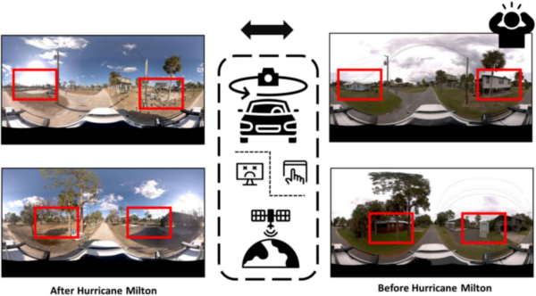
Maps of all shapes, sizes, and geographic regions which have emerged during COVID
How Maps During COVID Have Helped Communities Large and Small
Whether to inform, delight, or awe us, maps can change how we see and interact with our communities and world. And that has become more evident as the global community faces the COVID-19 pandemic together.
Between 2020 and 2021, many of us put aside our maps as we couldn’t move freely and safely. For many of us, maps became a sign of the lack of travel in our lives. Faraway places that we were not able to visit, roads to destinations that would normally hold excitement, family, and friends.
So it might be possible that maps have gone out of fashion or out of use for the time being. Yet, simultaneously, maps during COVID have offered a huge source of critical information to our governments and citizens worldwide
After a year of dealing with the COVID pandemic, there have been several maps which have emerged above others.
History of Web-Based Maps
Maps are a powerful tool that most of us have taken for granted in recent years. Since the inception of the Internet, there have been various ways to access non-paper maps. The most common are Google Maps, Bing Maps, Mapillary, and other online maps, which we access from our personal computers and smartphones.
Many assume that maps are easily accessible and navigable since they’re always in the palm of our hands. However, while this is true in some sense, it has not been without some difficulties or causes for concern.
First let’s have a look at what a web-based map is.
- A combination of geographical data overlaid onto digital maps.
- An interactive platform in which the maps are embedded into web pages or applications.
- Capable of multiple features and services through the use of traditional GIS functionalities within an easy to access web-browser on desktop or mobile.
- The user is often a novice in the cartography world
There are websites and blogs devoted to looking at the intricacies, impacts, and developments of digital maps and geospatial imagery. Ogle Earth (no, that’s not a misspelling), written by Stefan Geens, is one of them. It looks closely at how Google Maps and Google Earth are used by everyday citizens to tag their photos, to countries reclaiming the jurisdictions they are willing to be mapped by Google.
Maps and Infectious Diseases
COVID-19 was not the impetus for web-based maps, nor for ones concerning infectious diseases. Six years earlier a group of researchers looked at how visualizations tools for disease epidemics might help, hinder, or confuse.
Some of the concerns they and others have voiced, concerning maps created in reaction to such events include:
- Willingness of the average citizen to naively trust web-based maps
- The inexperience of the map creators
- Inaccurate information
- Misinterpreted data
Some have even claimed that maps have exacerbated the situation:
The flexibility, dynamism, and ease of creation inherent in today’s web-based mapping architectures have seen these digital maps become part of the ‘infodemic’ during the COVID-19 pandemic.
Peter Mooney, Levente Juhász
Yet other researchers claim that we need to hone our skills to create and analyze maps to benefit society.
constant need for map designers to effectively test and assess the usability of their products and services
Guanlong Li, Yueqing Li, Jing Zhang, Xiao Zhang
Maps During the Coronavirus Epidemic
The plethora of maps that have been created in the last year is really quite overwhelming and mind-boggling. We are probably familiar with some of the more ubiquitous ones shown on every news channel and website. Teams of researchers, data scientists, and professional cartographers specialize in creating maps to accurately portray the current state of things.
But there have been hundreds, if not thousands, more created by smaller municipalities, town governments, private individuals, and do-gooders. Below, we will look at a combination of both to appreciate the broad range of maps created since the onset of the coronavirus pandemic.
Insightful, Interesting, and Instructive Maps Created During COVID-19
Below is a sample of maps that emerged in 2020 and 2021, each created with different intentions for different communities. Some help the public assess risk, others help residents locate essential resources and services, and others evaluate the economic impact and enable businesses to survive.
This is by no means an exhaustive list, but we hope to highlight a few of the more unique cases.
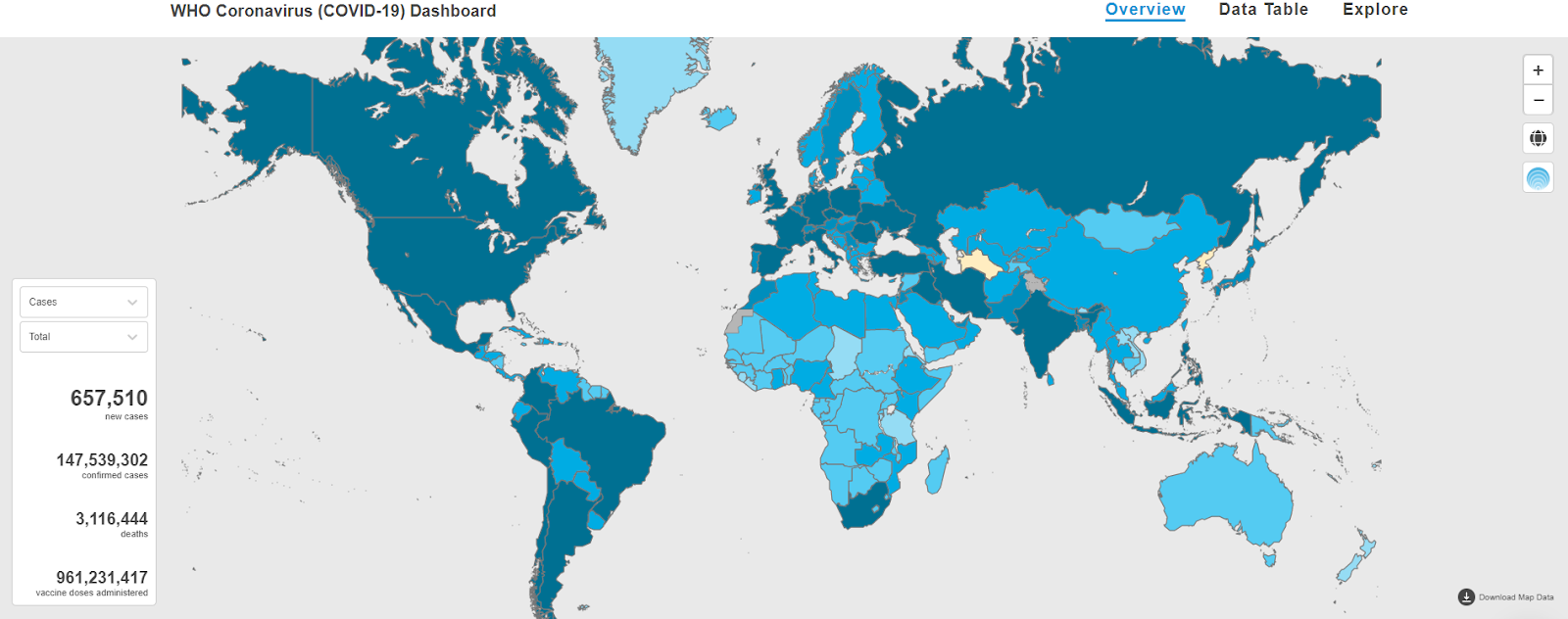
Map #1 – World Health Organization
We would be remiss not to mention at least one map from the WHO (Who Health Organization), the largest, most prestigious, and most influential health organization in the world. This might be the most widely respected and accepted map for tracking new cases, confirmed cases, and deaths. Most recently, they added a map of vaccine doses administered throughout the world.
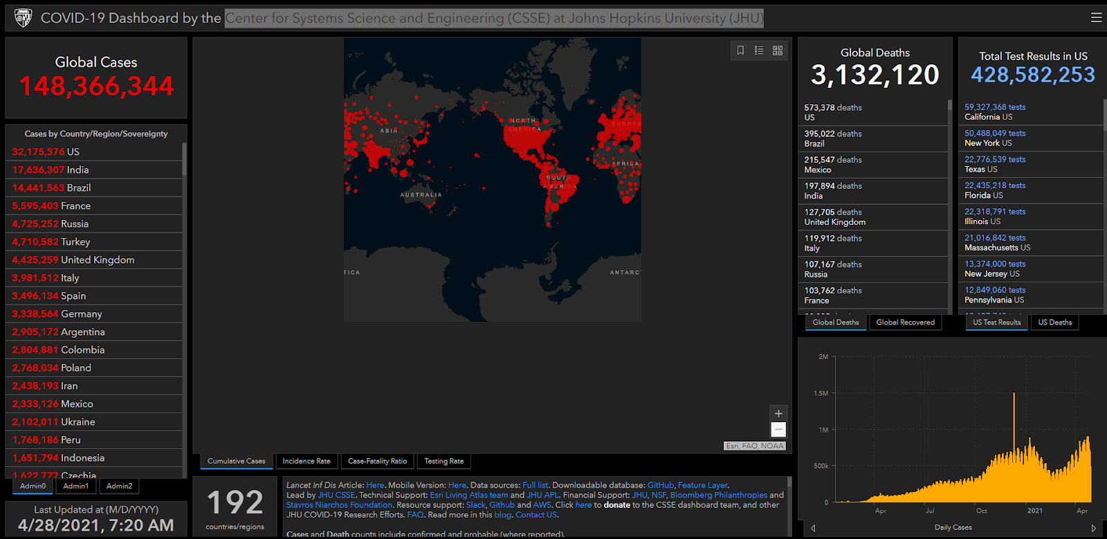
Map #2 – Center for Systems Science and Engineering – Johns Hopkins University
Another extremely advanced and expertly displayed COVID data comes from the Center for Systems Science and Engineering (CSSE) at Johns Hopkins University. Using GIS data and the ArcGIS platform, Johns Hopkins built an interactive map in high definition. The map highlights cumulative cases, incidence rate, case-fatality ratio, and testing rate. Map filters allow the viewer to see how the coronavirus is affecting communities of varying sizes: from countries, to provinces or states, to US counties (see the ‘Admin0, Admin1, and Admin2’ filters).
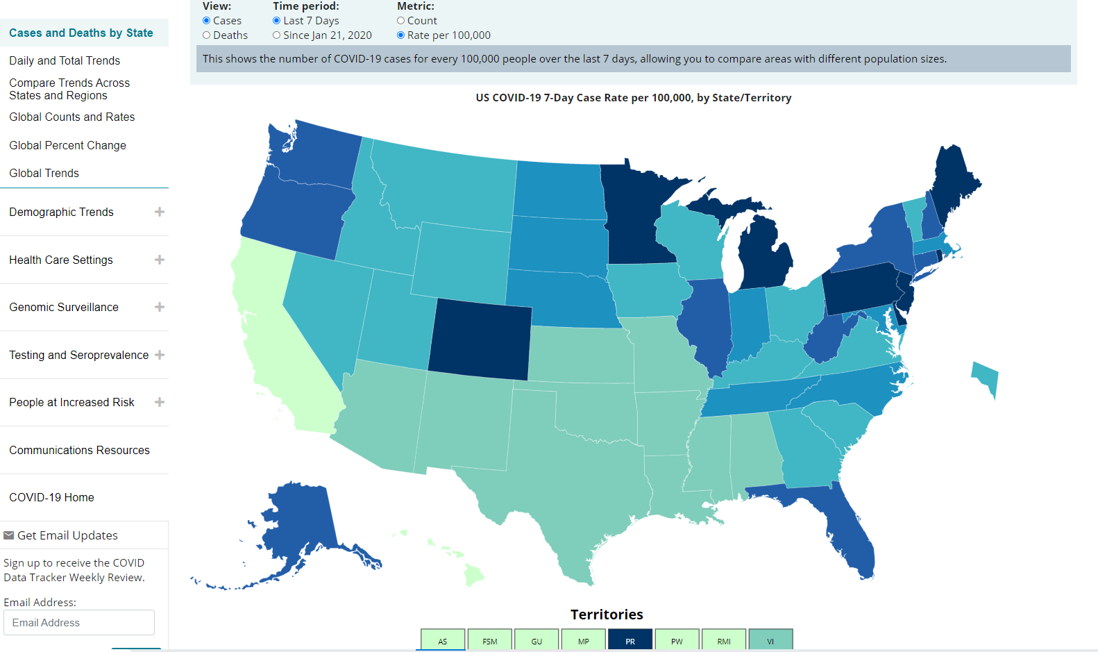
Map #3 – U.S. Center for Disease Control
The U.S. CDC (Centers for Disease Control and Prevention) offers another up-to-date map, granting us even further details concerning the demographics of those affected by COVID. They collected data about cases and deaths by race, ethnicity, age, sex, and other social factors.
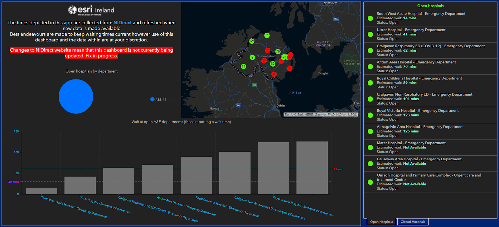
Map #4 – Northern Ireland Hospital Wait Time
This map for Northern Ireland helps patients who have been forced to postpone treatment monitor the wait times at hospitals for non-COVID-related medical needs. The map is refreshed whenever new data is made available concerning wait times, opening and closing times, and departments within the hospitals that are open.
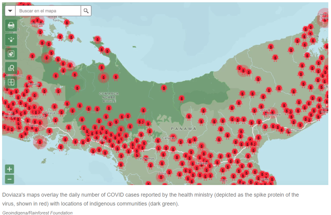
Map #5 – Indigenous Community Awareness – Panama
One man in Panama made a map to help the local indigenous communities during the last year. Carlos Doviaza, a self-taught cartographer, has been creating maps for several years now to help these local communities deal with land development issues and local leaders had already been using his maps to request land recognition from the state.
So when he saw what was happening during the COVID-19 crisis, he decided to use his honed skills to create an interactive online map that monitors the coronavirus situation in indigenous communities. It also provides information concerning what resources every community needs, the logistics involved in getting to the villages, and where different organizations are providing help.
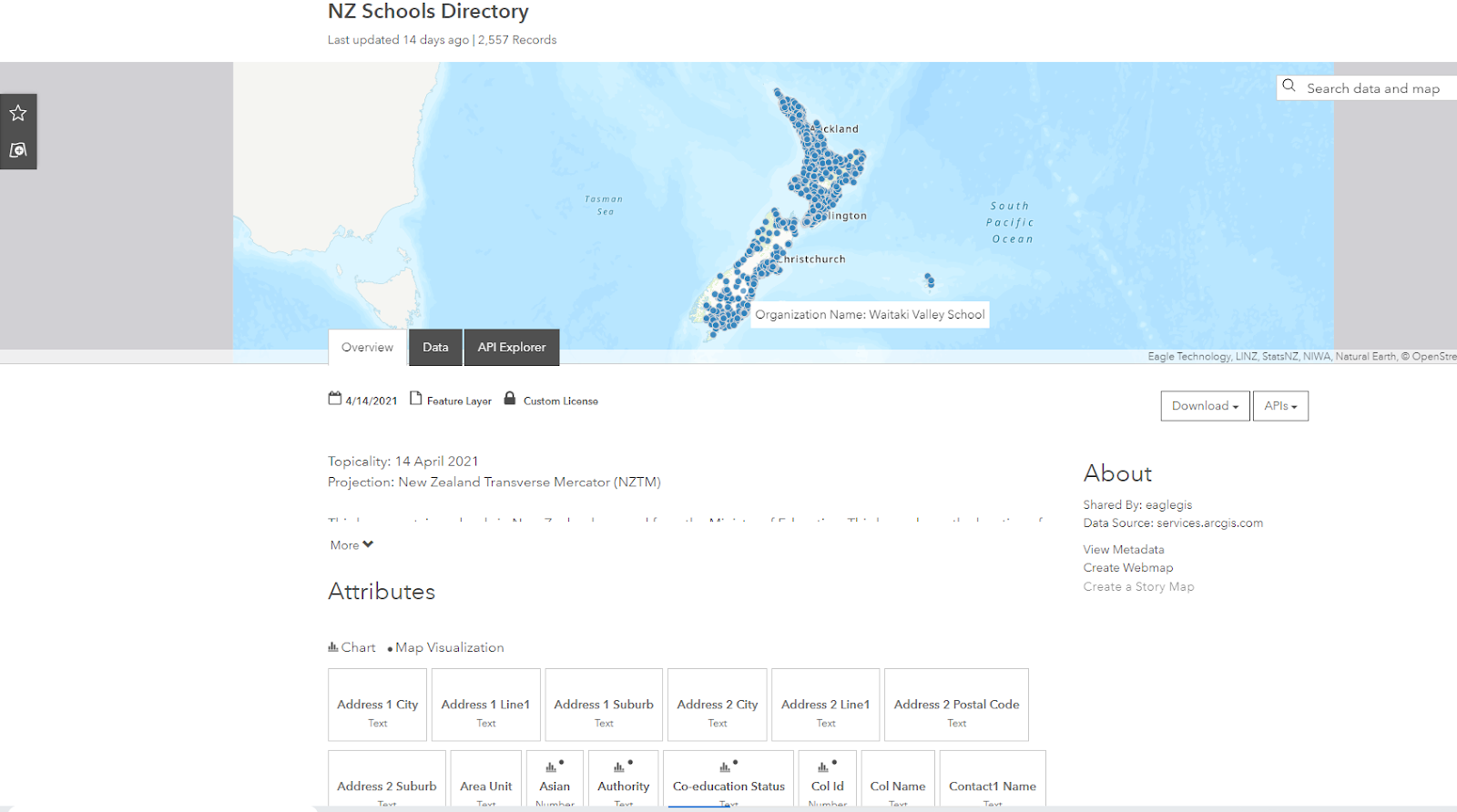
Map #6 – New Zealand Public Access and Updates
New Zealand used a number of GIS maps to keep its citizens up-to-date on the business hours and locations of shops, schools, supermarkets, aged-care facilities, and other governmental buildings.
Map #7 – Find a Mask in Taiwan
A Taiwanese civic hacker named Howard Woo created an app during the 2020 COVID-19 pandemic that tracked where people could find masks in Taiwan.
You can read more about his endeavours here.
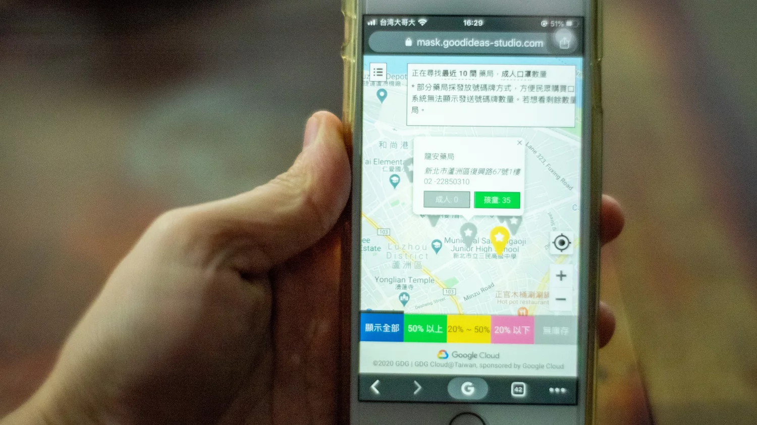
Image credit: Walid Berrazeg/SOPA Images/LightRocket via Getty Images
Map #8 – #SupportSeattleSmallBiz
In Seattle, the local government, along with its citizens, worked to create a map which identifies vulnerable small businesses so that local residents can know how and where to spend their money within their communities. Using the hashtag #SupportSeattleSmallBiz, the campaign worked with local restaurants, breweries and cafes in the Seattle area to keep locals abreast of any details necessary to find and frequent.
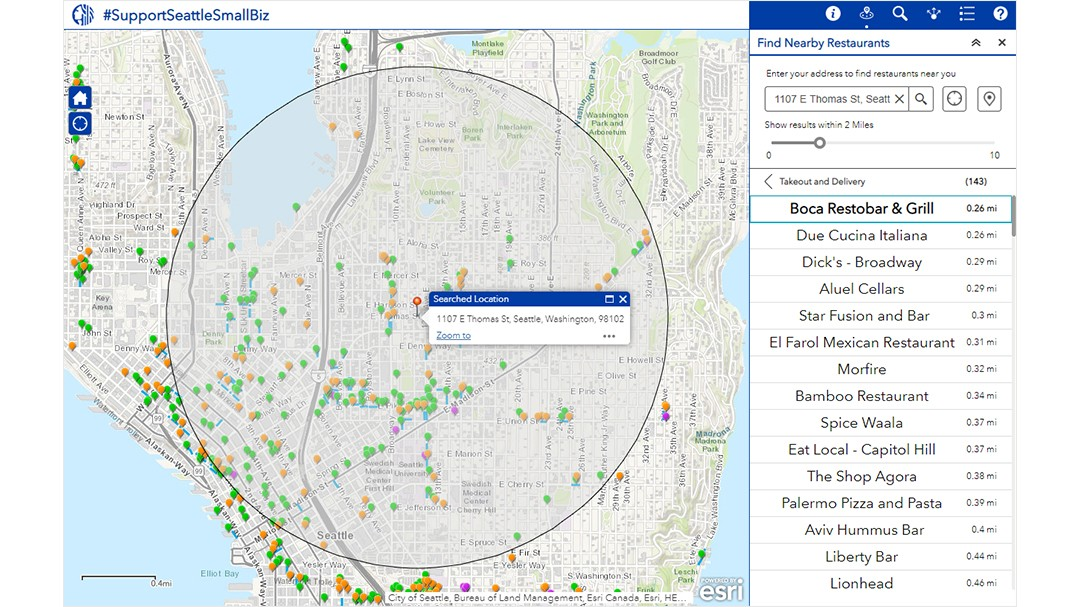
Image credit: esri
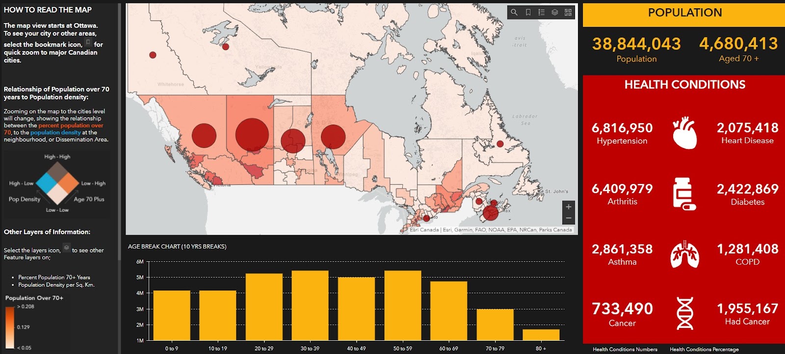
Map #9 – At-Risk Populations in Canada
Seeing as the COVID pandemic was adversely affecting the aging community, Canada decided to focus on creating a map that would allow local residents to understand the population by age demographic. This allows those moving about to understand the age makeup of the community and know the potential risks for those local senior citizens. The map shows the relationship between population over 70 years and population density, as well as the varying health conditions within those communities.
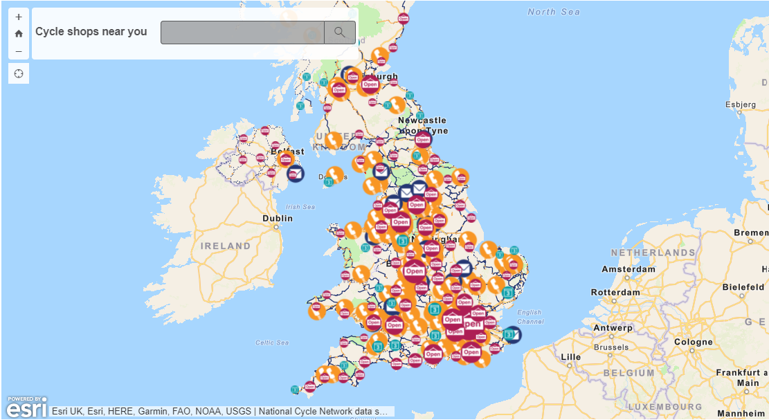
Map #10 – Find a Bike Shop – United Kingdom
Noting the rise in bicycling as a form of transportation, the UK seized on this trend and helped commuters more easily find bike shops and repair services. Their map, created with the help of Association of Cycle Traders shows viewers all of the independent bike shops that are currently open across the UK. It also presents the National Cycle Network routes, , as well as offers on bike services and equipment available to keyworkers (such as first responders) during the pandemic.
Summary
As map makers ourselves, Mosaic understands the importance of having the right data to create impactful, meaningful maps. That’s why our line of Mosaic 360º cameras are built to offer the highest definition on the market. We are proud to participate in the creation of maps which will enhance the decision making process for companies and individuals, as well as build more powerful tools for improving the lives of citizens around the world.
So go out and explore the world through maps, find a new destination, learn something interesting, discover a different point of view.
And one last thing: for the cartophiles among us, may we make a few suggestions.
Google Maps Mania, is a collection of some of the best digital interactive maps found on the internet and dives into the tools used to create them. Originally conceived by Mike Pegg, the site has created a community of maps enthusiasts who collaborate to keep the site up-to-date on the newest maps popping up across the globe, from Earthporn – the Prettiest Places on Earth, to mapping world obesity.
And if you want to see some more unique, beautiful, and personal maps created in the last year or so, during the world pandemic, then check out some submissions to CityLab or watch this video below:
If you have some other interesting maps to share, please feel free to leave them below in the comments.