Geospatial technology saw the start of the war, and maps of Ukraine in war are helping those in the midst of it now.
*This article was written in collaboration with Lynn Puzzo and CEO Jeffrey Martin.*
Geospatial technology was the first to detect the Russian advance into Ukraine on February 24th. As one article put it, “These Nerds Saw Ukraine Invasion Start On Google Maps Before Putin Said a Word”. This refers to a group of academics in California, who had been reviewing Google Maps traffic monitors near the Russian military encampment south of Belgorod (a Russian town near the Ukrainian border) and noticed something had changed.
One even tweeted that he saw a traffic jam take shape and emerge as Russian military vehicles started moving towards the Ukrainian border at 3 a.m. – hours before Putin ever announced anything.
Emerging open-source geospatial data cuts through the smoke
In addition to the already well-known Google Maps, another ‘new’ geospatial technology is literally breaking barriers. Synthetic aperture radar (SAR) exceeds traditional satellite imaging, which requires daylight and clear skies to capture images.
SAR is able to break through “clouds and smoke, even in very large storm events or fires, so we can reliably capture clear and precise images of the Earth under almost any conditions,” said Dan Getman, Capella Space vice president of product, one of the leading companies in SAR technology.
This is enabled by sensors that shoot down energy, and then record the amount that reflects back to them.
Not only is the technology emerging as the next step in satellite imagery, but the access is also revolutionary. Capella Space and other private organizations are able to provide data to the public, which was previously only available to governments and spy agencies.
This use of third-party imagery has helped fill the gap left by a growing distrust of the US and British governments since the 2003 Iraq war.
The commercialization of satellite imagery gives users (citizens, governments, private corporations) a more transparent understanding of the situation, which can empower those who have been left in the dark. It allows users to react quicker, gain advantages, manage risk, and answer questions.
User-generated maps
Ukraine’s Customs and Border Security Service leveraged the power of Google Maps as an open platform and has created an interactive map to monitor the lines at the border crossings in Ukraine.
The map shows checkpoints on the borders with Poland, Hungary, Slovakia, Romania, and Moldova, although (at least initially) they recommend against using Polish border crossings as much as possible, as they are heavily loaded compared to the rest. Reports state that over half of all those fleeing Ukraine have crossed to Poland.
At this point in time, it is believed that more than 4 million Ukrainians have fled the country altogether, many of whom crossed the borders at these very checkpoints indicated in this map. Additionally, some 200,000 non-Ukrainians who were living, working, or studying in the country have also escaped.
This first screenshot was taken 2 weeks ago (mid-March). You can see that the border with Poland was especially crowded, as there are more yellow and orange icons.
And now, in just a few weeks (data from March 31st), we can see the improvement of the wait time at border crossings.
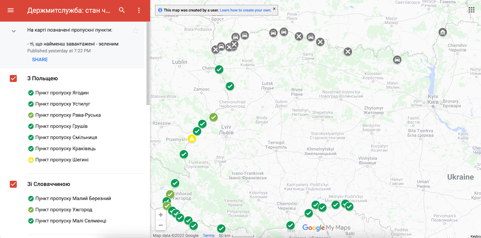
The map gives users vital details and functionalities such as
- Ability to choose the border based on the country
- Name of the checkpoint
- Whether it’s possible to cross on foot or by vehicle only
- The latest update of the information
- And how many of each: cars, buses, and pedestrians last crossed
Creating your own maps in Google Maps
As previously stated, this map was created by the Ukrainian Border Services. Google Maps allows users to create such maps quite easily for a variety of purposes. It’s a great place to store all your tips when traveling to a new location or creating ‘best of’ lists.
While we certainly wish that maps, GIS, and geospatial technology were here for the fun times, it is also important that they exist for times such as this. Much the same as during the start of the coronavirus pandemic, many organizations and average citizens created COVID maps, which greatly benefited their community members.
******************************************************************
The following comes from our CEO, Jeffrey Martin, in a recent LinkedIn article he wrote:
The Importance of Accurate Maps of the War in Ukraine
I want to start with a HUGE disclaimer – most of this information is gleaned from a Twitter thread I was following by MaxCRoser. He started a post about the importance of accurate maps, especially in times of war, with specific examples of how maps can be wrong and how to make them better. So a big ‘thank you’ to Max and his work in calling attention to this and highlighting how even big news agencies sometimes get it wrong.
I decided to write this article here to gather the thread into one article and hopefully bring it to my audience here on LinkedIn – for map enthusiasts, those concerned with the current state of the war in Ukraine, and those interested but unaware of the power of maps and data.
Max starts his tweet with:
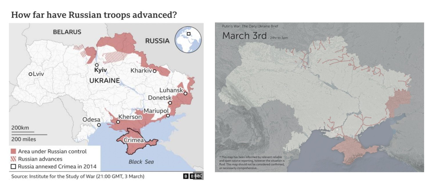
“I think the visualization teams in many media outlets need to rethink how they map the war. Most do maps like the one on the left. But that does not reflect their own reporting. There aren’t entire *areas* that are ‘under control’.
On the right is a more accurate alternative.”
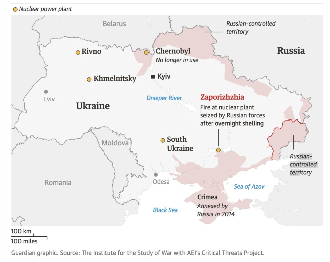
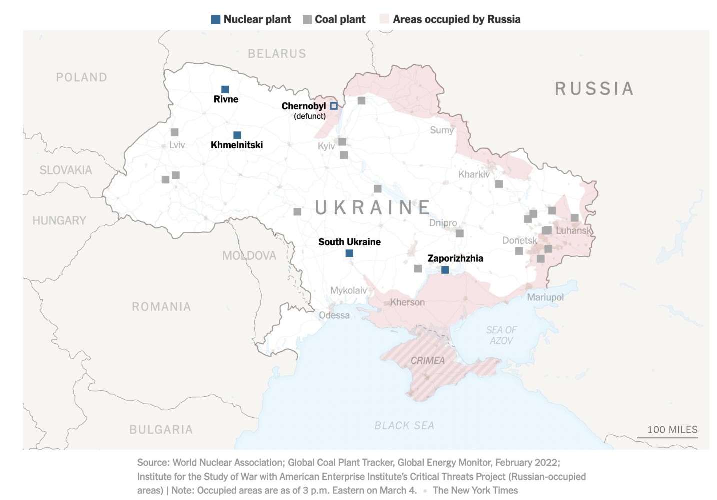
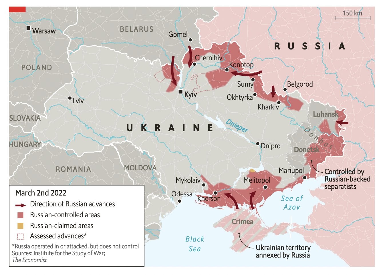
He gives a few more examples from The Guardian, The New York Times, and The Economist
He also mentions Kiko Llaneras, from El País, commending them for their choice of words in labeling areas, “avance de tropas rusas” (advances of Russian troops) rather than “controlled areas”.
There is no way of knowing whether the BBC or UK MoD saw what Max and others were talking about on Twitter or other platforms, but within 3 days (the first image from March 3) to the second image (dated March 6), the UK MoD changed how they are representing the current situation of Russian troops, advancement, and presence.

Why am I sharing this?
Because it’s important to know that we must always have the correct data on hand to create maps. Since we’re visual people, maps are one of the most effective ways to share information. Additionally, we need to have the know-how and technology to correctly interpret the data for the viewer.
Data is super important and powerful, if used correctly.
Check out more of Max’s great work, including his latest tweet about nuclear weapons.
Jeffrey Martin